Visual identity
Identity toolkit
Our visual identity toolkit helps portray a distinct and memorable presentation of our brand. This section describes the core ingredients of our brand’s unique graphic system.
Logo
DownloadThe new logo builds on the equity of our existing mark while evolving it into a more modern, simplified, and scalable system that is versatile across today’s digital and physical touch-points. The icon uses organic, cell-inspired shapes arranged precisely to represent how we combine science with patient-centered care. The outward movement of the icon suggests growth and progress, while its repetitive symmetry conveys technological excellence. Together, the mark symbolizes how we set the global standard for fertility care across the entire patient journey.
Our primary logo should be used the majority of the time. In some instances, the standalone icon may be used as a branded design detail. For example, overlaying a photo in the corner of an Instagram post or on branded items such as a hat.
Primary logo
Standalone icon
Logo clear space and minimum size
To ensure high visibility and an uncluttered presentation, always maintain clear space around the HRC Fertility logo. Determine clear space by measuring the height of the icon (see diagram) and keep a square area equal to this on all sides of the logo. Note that the clear space will change depending on the size of the logo.
Logo color use
Shown below are all of the logo and color combinations that can be used.


Incorrect logo use
To maintain the integrity of the brand, avoid manipulating or modifying the HRC Fertility logo. These examples are select instances of incorrect usage of the logo.
Color palette
DownloadConsistent use of color will help unify all applications of the HRC Fertility brand. Remember to use RGB or Hex values for digital tactics only and CMYK values for all printed materials.
- Hex: #4A3B34
- RGB: 74, 59, 52
- PMS: 2478
- CMYK (Coated): 50, 73, 51, 61
- CMYK (Uncoated): 50, 62,35, 54
- Hex: #f8f6f7
- RGB: 248, 246, 247
- PMS: Cool Gray 2 20%
- CMYK (Coated): 3, 2, 2, 0
- CMYK (Uncoated): 3, 2, 2, 0
- Hex: #ece9e6
- RGB: 236, 233, 230
- PMS: Cool Gray 2 60%
- CMYK (Coated): 8, 6, 5, 0
- CMYK (Uncoated): 10, 7, 7, 0
- Hex: #dad7d5
- RGB: 218, 215, 213
- PMS: Cool Gray 2
- CMYK (Coated): 14, 10, 8, 0
- CMYK (Uncoated): 16, 12, 12, 0
- Hex: #e5eaf0
- RGB: 229, 234, 240
- PMS: 538 60%
- CMYK (Coated): 11, 5, 1, 0
- CMYK (Uncoated): 10, 4, 0, 0
- Hex: #d4dee1
- RGB: 212, 222, 225
- PMS: 538
- CMYK (Coated): 19, 9, 2, 0
- CMYK (Uncoated): 16, 6, 0, 0
- Hex: #e9e9d8
- RGB: 233, 233, 216
- PMS: 5807 60%
- CMYK (Coated): 10, 4, 19, 0
- CMYK (Uncoated): 8, 10, 19, 0
- Hex: #d3d3b6
- RGB: 211, 211, 182
- PMS: 5807
- CMYK (Coated): 16, 6, 31, 0
- CMYK (Uncoated): 14, 16, 32, 0
- Hex: #f4f2e0
- RGB: 244, 242, 224
- PMS: 7500 60%
- CMYK (Coated): 4, 6, 19, 0
- CMYK (Uncoated): 2, 5, 20, 0
- Hex: #ebe4cc
- RGB: 235, 228, 204
- PMS: 7500
- CMYK (Coated): 7, 10, 31, 0
- CMYK (Uncoated): 4, 9, 33, 0
- Hex: #eadfd1
- RGB: 234, 223, 209
- PMS: 482 60%
- CMYK (Coated): 5, 10, 12, 0
- CMYK (Uncoated): 3, 10, 12, 0
- Hex: #dbcab6
- RGB: 219, 202, 182
- PMS: 482
- CMYK (Coated): 8, 17, 20, 0
- CMYK (Uncoated): 5, 17, 20, 0
- Hex: #f2e4e0
- RGB: 242, 228, 224
- PMS: 4755 60%
- CMYK (Coated): 6, 11, 10, 0
- CMYK (Uncoated): 4, 11, 11, 0
- Hex: #dac7be
- RGB: 218, 199, 190
- PMS: 4755
- CMYK (Coated): 10, 19, 17, 0
- CMYK (Uncoated): 7, 18, 18, 0
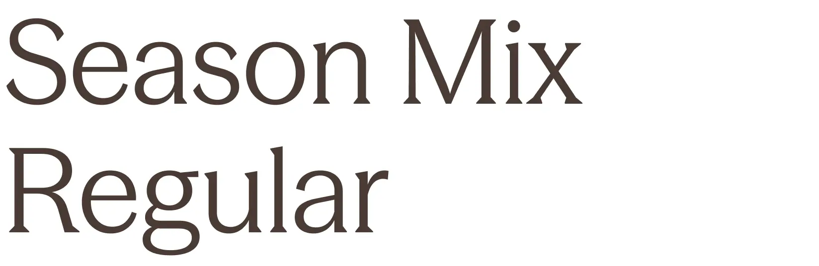
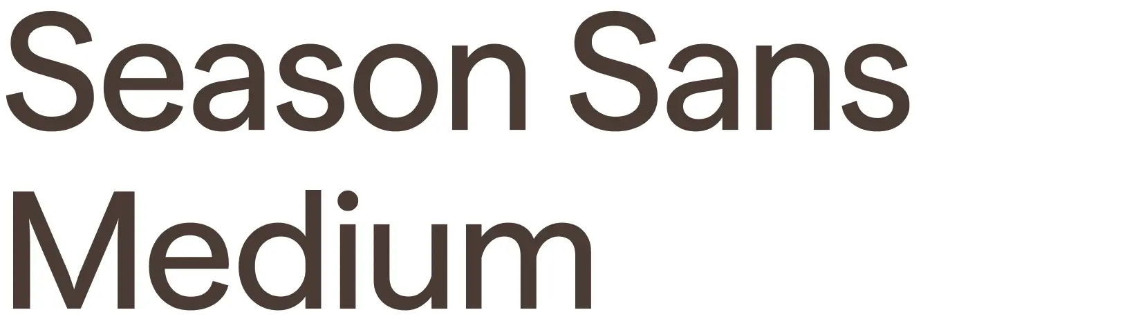
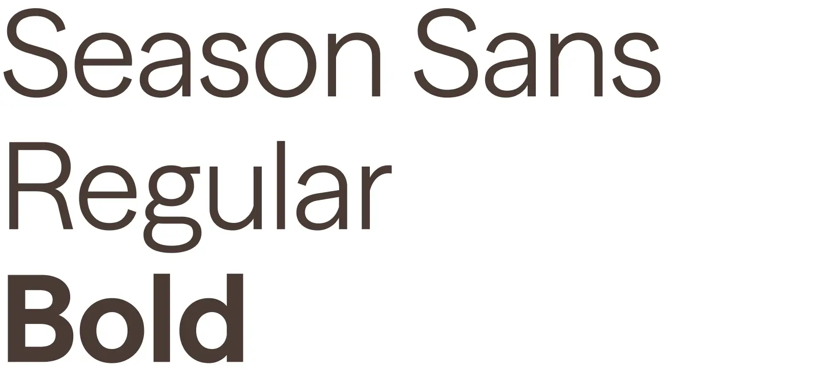
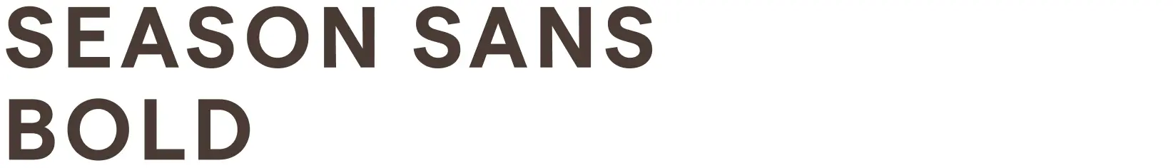
Typography
Typography is an important aspect of our brand identity. Our brand typeface is called Season. Use the following guide to know which version and font weight to use.
In instances where Season is not available because of application constraints, the Microsoft font Aptos can be used. In rare instances when a system font is needed, default to Arial.
Only use weights:
Regular
Sentence case
Only use weights:
Medium
Sentence case
Only use weights:
Regular
Bold
Sentence case
Only use weights:
Semibold
All caps only
10% tracking
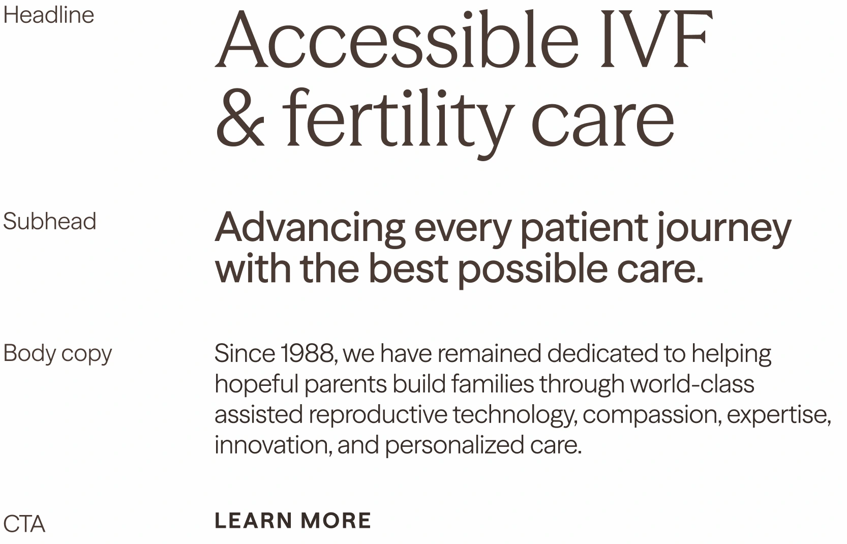
Type hierarchy
Type hierarchy is important to create visual balance and establish direction of messaging to our customers.
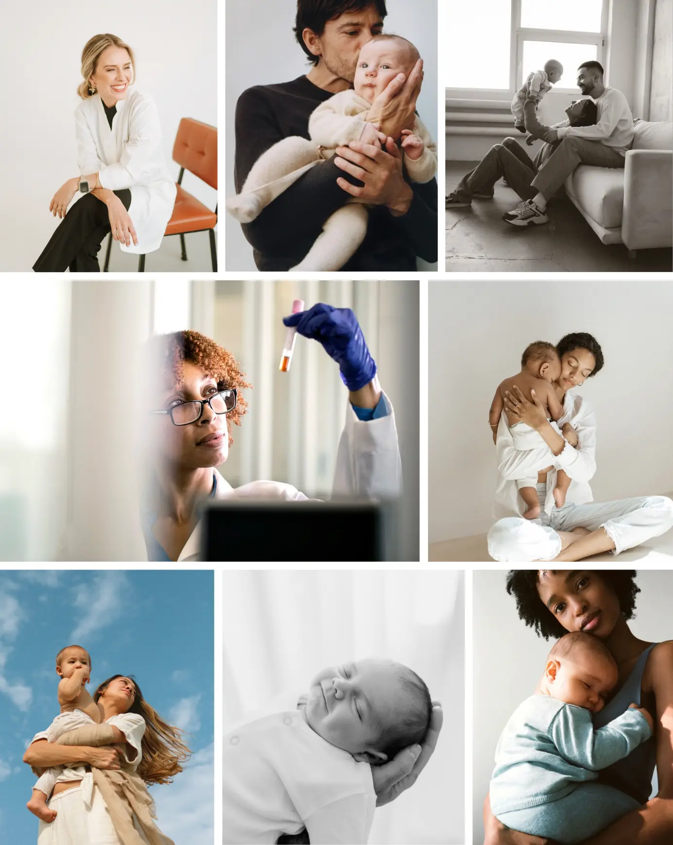
Photography Style
A mix of portraiture in simple studio settings and minimal environments to maintain simplicity and establish a clear focus on the individuals. Bright lighting that feels approachable and calming. Natural tones and occasional black and white moments to complement the color palette and place greater emphasis on the people themselves.
Note: Images shown here are for stylistic reference only.